
SaaS Alternatives Pages That Convert and Rank
Learn how a SaaS alternatives page can rank, build buyer trust, support AI visibility, and convert high-intent comparison traffic.


Buyers rarely search for a category page when they are close to a software decision. They search for options, tradeoffs, migration risk, pricing fit, and whether a tool will hold up after the demo. That is why a strong SaaS alternatives page can become one of the most commercially useful assets on a site.
It can attract decision-stage traffic, support rep-free research, and give search engines a clear reason to rank your page for comparison intent. It can also help AI systems quote your brand in a more grounded way, because the page presents structured facts, differentiated claims, and practical buying context instead of generic marketing copy.
Why SaaS alternatives pages match B2B buying behavior
B2B software buying has become far more self-directed. Gartner reports that 61% of B2B buyers prefer an overall rep-free buying experience, and that preference changes what a good website needs to do. When a prospect lands on an alternatives page, they are not asking for inspiration. They want help making a shortlist.
That same research points to a high standard for on-site experience. Gartner also reports that 76% of B2B buyers will avoid suppliers that provide bad website experiences. If an alternatives page is thin, vague, or obviously written for search volume instead of buyer clarity, it creates friction at exactly the wrong moment.
There is another issue that matters here: trust. Gartner says 69% of B2B buyers notice inconsistencies between a company’s website and what sellers tell them. An alternatives page can reduce that gap by giving buyers a stable, self-serve source for category fit, implementation expectations, and side-by-side differences.
After a clear intro, the page should help a buyer answer a practical question: Should this product make my vendor selection shortlist?
- Category fit: Who the product is built for, and who it is not built for
- Switching trigger: Why someone starts looking for alternatives in the first place
- Comparison lens: Features, workflow fit, support model, pricing logic
- Implementation support: What setup, migration, or rollout actually looks like
What search engines and AI systems reward on comparison pages
Google’s guidance remains straightforward: ranking systems are built to prioritize helpful, reliable, people-first content. For alternatives pages, that means surface-level rewrites are weak by design. A page that simply says “Here are the top 10 competitors” without original analysis gives neither the buyer nor the search engine much reason to trust it.
Google also recommends original information, research, analysis, and a substantial treatment of the topic. That matters more on comparison pages than many teams realize. Buyers are already familiar with the category. They are looking for interpretation. They want to know which product is better for a specific use case, which one is easier to implement, and where tradeoffs start to matter.
Page titles matter too. Google has said that titles are the first line of each result and the links people click in search. It may also generate alternative titles when a page title does not fit the query well. For a SaaS alternatives page, this means the title should map tightly to intent instead of trying to sound clever.
A strong title usually names the comparison and the buyer task directly. “Top [Competitor] Alternatives for Mid-Market Finance Teams” gives both search engines and humans something precise to work with.
AI visibility fits into this picture, but it should be viewed with discipline. Ahrefs found that AI referral traffic is still tiny across a broad website sample, yet best-of content, product pages, and guides drive a meaningful share of what does arrive. A well-built alternatives page is valuable even before AI traffic becomes large, because it also feeds search rankings, sales conversations, and on-site conversion.
Core elements of a SaaS alternatives page that convert
An alternatives page works best when it combines comparison clarity with enough depth to support real evaluation. Gartner’s research is useful here again: B2B buyers want product comparison tools and implementation support. Those are not nice extras. They are decision assets.
The biggest mistake is treating the page like a disguised landing page. Buyers can tell when “alternatives” really means “we are better than everyone else.” A stronger approach is to make the evaluation process easier, even if that means acknowledging where another tool may be a better fit.
That honesty does not weaken conversion. It sharpens it. When a page clearly defines fit, it filters out poor leads and increases confidence among good ones.
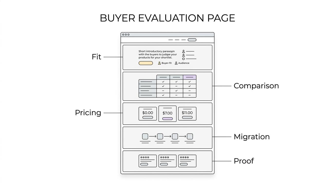
Here is a practical framework for the page elements that matter most:
[markdown] | Page element | What the buyer needs | Why it helps performance | | --- | --- | --- | | Clear headline and intro | Immediate confirmation of the comparison topic | Better intent match for search and lower bounce risk | | “Why people look for alternatives” section | Validation of pain points and switching triggers | Captures long-tail intent and builds relevance | | Side-by-side comparison table | Fast evaluation across key criteria | Supports self-service research and featured snippets | | Use-case segmentation | A sense of fit by team size, workflow, or industry | Improves conversion by narrowing the audience correctly | | Pricing and packaging notes | Realistic cost expectations | Reduces wasted demos and low-fit pipeline | | Implementation and migration details | Confidence around rollout and switching effort | Matches buyer demand for implementation support | | Evidence layer | Reviews, proof points, product facts, references | Increases trust and supports AI citation quality | | Strong CTA options | Demo, self-serve trial, migration guide, buyer checklist | Meets different levels of purchase readiness | [/markdown]A page like this does more than rank. It acts like a buying tool.
How to structure comparison content for decision-stage intent
Structure is where many alternatives pages either win or fade out. The best pages feel easy to scan, but they are not shallow. They move from broad comparison to practical detail in a sequence that mirrors how buyers think.
Start with a plain-language opening that names the competitor, the category, and the type of buyer the page is meant for. Then move quickly into the reason buyers search for alternatives. Are they frustrated by pricing expansion? Missing workflows? Weak reporting? Poor support? Limited integrations? Those motives should shape the rest of the page.
After that, the page should present a comparison framework that stays consistent. If you compare products by features in one section, by industry in the next, and by pricing philosophy in the next, the page becomes hard to trust. Buyers want a stable lens.
A useful pattern looks like this:
- Best for: Define where your product fits most naturally
- Not ideal for: State the cases where another option may suit better
- Key differences: Call out the few distinctions that change the buying decision
- Migration path: Explain setup time, support, and switching complexity
- Proof: Add evidence that supports the claims on the page
That structure also helps AI systems. Large language models tend to respond well to content with direct assertions, clear entities, and repeated factual consistency. If your page names the competitor, the use case, the target team, and the implementation reality in a stable format, it becomes easier to quote accurately.
What high-performing SaaS alternatives pages sound like
Tone matters more than most templates suggest. Buyers at this stage do not need hype. They need confidence, precision, and enough candor to trust the page.
That usually means writing with fewer broad claims and more grounded comparisons. Instead of “powerful automation,” say what kind of automation is available and for whom it matters. Instead of “easy onboarding,” describe whether implementation support includes migration help, admin training, or integrations assistance.
The page should also avoid false neutrality. It is acceptable to argue that one option is stronger for a specific team, as long as the claim is backed by evidence and framed around fit. A page that tries too hard to appear unbiased often becomes generic. A page that is specific about buyer context feels more useful.
One sentence can do a lot of work here: This product is a better fit for companies that need X and are willing to trade off Y.
Common mistakes that weaken search visibility and conversion
Most underperforming alternatives pages fail for familiar reasons. They target the keyword but miss the buyer.
Common issues include:
- Thin intros with no real comparison value
- Vendor-bashing instead of useful analysis
- Generic feature grids copied from product pages
- No implementation support or migration detail
- Titles that do not match the query clearly
- No evidence, references, or product facts
- One CTA for every visitor, no matter their intent
- Content written for traffic volume rather than shortlist decisions
A weaker page usually tries to persuade too early. A stronger page helps the buyer sort the market first, then makes the next step obvious.
How to make the page rank for more than one comparison query
Many teams think of an alternatives page as a single-keyword asset. That leaves a lot of value on the table. A good page can rank for branded alternative terms, “vs” queries, category-specific comparison phrases, implementation-related searches, and use-case modifiers.
This only works if the content is organized around real subtopics instead of keyword stuffing. Each section should answer a distinct buyer question. “Why teams switch,” “how pricing differs,” “what implementation involves,” and “which companies fit each option” each expand the page’s ability to rank without diluting intent.
It also helps to treat the page as part of a small content cluster. Internal links from migration guides, category pages, pricing explainers, and competitor comparison posts give search engines a stronger sense of topical depth. For answer engine optimization programs, that connected structure matters because it reinforces entity relationships and claim consistency across the site.
Metrics that show whether the page is doing its job
Traffic alone is too small a frame. Alternatives pages are built for high-intent traffic, so their real value shows up in quality signals and pipeline contribution.
Look at search query mix first. Are visitors arriving from branded competitor terms, use-case comparison terms, and shortlist-style searches? If the page ranks mostly for broad informational queries, the intent match may still be off.
Then look at conversion behavior. Time on page can be useful, but click depth is often better. Are people using the comparison table, moving to pricing, opening migration resources, or requesting a demo from the page? Those actions show the page is helping buyers self-serve.
A focused scorecard can keep the page honest:
- Query quality: Competitor and decision-stage search terms
- Engagement depth: Scroll, comparison-table interaction, CTA progression
- Sales alignment: Whether page claims match seller messaging
- Pipeline impact: Demo rate, influenced opportunities, close-rate quality
- AI visibility: Mentions, citations, and answer inclusion across major systems
When these pages work well, they become more than SEO content. They become sales infrastructure that search engines can rank, buyers can trust, and AI systems can cite without much ambiguity.
That is the real opportunity: build a page that helps people make a good decision, and the ranking signals usually get stronger from there.


