
How to Create BOFU Pages That Convert
Learn how to build bofu pages that convert with clear offers, proof, objection handling, and CTAs that turn high-intent traffic into leads.


Most bottom-of-funnel pages fail for a simple reason: they still read like awareness content.
A buyer who lands on a BOFU page is not asking, “What is this category?” They are asking, “Why should I choose this offer, right now, with my budget, and with my reputation on the line?” That is a very different standard. It demands clarity, proof, and a next step that feels safe.
When a BOFU page converts well, it does not rely on clever design or inflated claims. It removes doubt in the order buyers actually feel it.
Why BOFU pages convert better than generic landing pages
A generic landing page tries to appeal to everyone. A strong BOFU page is narrower, sharper, and far more useful to the people who are ready to buy. It speaks to a defined audience, names a concrete outcome, and gives visitors enough confidence to take action without making them hunt for answers.
That is why high-performing BOFU pages often feel more direct than brand pages. They are built around intent, not broad messaging. They do not drift into abstract positioning. They tell the visitor what they will get, why it matters, and what happens next.
This is also where many teams lose momentum. They invest heavily in top-of-funnel content, then send warm traffic to pages that are vague, underproofed, or overloaded with choices. A high-intent visitor should never have to assemble the case for conversion on their own.
BOFU page structure: the sections that drive conversions
The strongest BOFU pages usually follow a simple sequence. First, they make the offer obvious. Then they support it with proof. After that, they address objections and repeat a clear call to action.
That sequence matters because buyer confidence is cumulative. Each section should answer the next unspoken question.
A practical structure looks like this:
[markdown] | BOFU page section | What it needs to do | What happens if it is weak | | --- | --- | --- | | Hero section | State audience, outcome, and primary CTA | Visitors bounce or keep searching | | Trust block | Show logos, metrics, ratings, or media proof | Buyers question credibility | | Benefit section | Translate the offer into business results | The page feels generic or feature-heavy | | Offer details | Explain scope, process, timeline, or pricing logic | Visitors hesitate because key details are missing | | Objection handling | Answer questions about fit, effort, risk, and ROI | Friction rises late in the decision | | Repeated CTA | Let motivated users act without scrolling back | Intent drops before conversion | [/markdown]A page like this does not need to be flashy. It needs to be legible. The visual hierarchy should make the next decision easy at every scroll depth.
One lesson worth carrying into every build: long pages are fine, but only when every section earns its place.
BOFU copywriting: specific messaging that moves buyers
Copy is where conversion lift usually starts.
At the bottom of the funnel, vague language is expensive. Buyers respond to specificity because specificity sounds accountable. “Improve efficiency” is weak. “Reduce manual reporting time by 8 hours per week” is better. “Get a working demo tailored to your workflow in 20 minutes” is better still.
The best BOFU copy is outcome-led, concrete, and calm. It does not oversell. It reduces interpretation. It gives the buyer enough detail to picture success and enough certainty to act.
A few writing patterns consistently work well:
- Headline: Say who the page is for and what result it helps create
- Subheadline: Clarify the offer, the use case, or the reason it is different
- CTA text: Describe the next step in plain language, not generic form language
- Microcopy: Explain what happens after the click, how long it takes, and whether there is any commitment
- Proof captions: Tie every metric or testimonial to a business outcome
That same discipline applies to forms. “Submit” is weak because it says nothing about the value on the other side. “Book a strategy call” or “Get a pricing review” gives the visitor context and lowers uncertainty.
Short sentences help here.
So does restraint.
A BOFU page does not need more adjectives. It needs fewer gaps.
BOFU trust signals: proof, ROI, and objection handling
Trust is not one section. It is a pattern repeated through the page.
This is where many [service] and SaaS pages improve quickly. They add a testimonial block near the bottom and assume credibility has been handled. In reality, trust should appear early and often: in the hero, near the CTA, beside the form, inside the case studies, and in the FAQ. A strong example of this approach can be seen in Austin Heaton’s own site architecture. The homepage behaves more like a focused sales page than a digital brochure. It leads with specialist positioning, puts a booking CTA in high-visibility locations, adds quantified proof near the top, and keeps reinforcing ROI through case studies, testimonials, and a clear explanation of how results are measured. That matters because warm buyers often need evidence of accountability as much as evidence of expertise.
The highest-impact trust elements are usually straightforward:
- Client logos
- Featured publication logos
- Quantified case studies
- Testimonials with real names and titles
- Process clarity
- FAQ-driven objection handling
Case studies deserve special attention because they do more than signal popularity. They show causality. A useful BOFU case study gives a starting point, the intervention, and a measurable outcome. Without that structure, “proof” turns into decoration.
It also helps to explain how success will be measured. For higher-ticket offers, buyers want to know that results will be visible, attributable, and tied to the business outcome they care about. That is especially relevant in B2B categories where pipeline quality matters more than lead volume.
BOFU page types: matching format to buyer intent
Not every BOFU page should look the same because not every buyer arrives with the same question.
Someone landing on a pricing page is trying to compare options. Someone on a demo page wants to see fit. Someone on a comparison page is closer to a vendor decision and often needs reassurance around tradeoffs, migration, or differentiation.
Here is a simple way to think about format selection:
[markdown] | BOFU page type | Best use case | Best primary CTA | | --- | --- | --- | | Pricing page | Self-serve or semi-self-serve evaluation | Choose plan | | Demo page | Complex or higher-ticket products | Book demo | | Service page | Consultative offers with custom scope | Book a call | | Comparison page | Competitive intent and switching evaluation | Compare options or talk to sales | | Trial signup page | Product-led offers with fast time to value | Start free trial | [/markdown]The wrong format can suppress conversion even when the copy is strong. A high-friction demo form on a low-friction product can hurt volume. A thin service page with no proof can hurt trust. A pricing page that hides packaging details can stall buyers who were almost ready.
Match the page to the decision the buyer is trying to make, not the page type your team happens to prefer.
BOFU page optimization: analytics, testing, and lead quality
Once a BOFU page is live, the job is not done. It has just become measurable.
The best teams treat BOFU pages like revenue assets, not static web pages. They watch where buyers stop scrolling, where they hesitate, which forms get abandoned, and which variants produce qualified pipeline rather than low-intent submissions.
A useful optimization stack often includes both quantitative and behavioral signals. Conversion rate tells you what happened. Session recordings, heatmaps, and funnel data help explain why.
Start with the fundamentals:
- Traffic source and intent
- CTA click-through rate
- Form completion rate
- Sales-qualified lead rate
- Opportunity and revenue influence
That last metric changes the conversation. A page can generate more form fills and still be worse for the business if lead quality drops. BOFU optimization should protect intent, not just inflate volume.
Testing priorities should stay close to friction points. Headline clarity, CTA wording, form length, proof placement, pricing presentation, and FAQ structure all deserve attention because they affect the buyer’s confidence at moments of decision.
A practical test backlog might focus on:
- Hero message: tighter audience-to-outcome fit
- Proof placement: moving case study metrics higher on the page
- Form friction: removing unnecessary fields
- CTA framing: making the next step more explicit
- Objection handling: answering buyer concerns before the form appears
Keep the page focused on one primary action. Secondary paths are useful only when they support the main conversion path, like viewing proof before booking a call.
BOFU page mistakes that quietly kill conversion
Most BOFU conversion problems are not dramatic. They are small trust leaks and clarity gaps that add up.
A page can look polished and still underperform because it asks the visitor to do too much cognitive work. If the page hides pricing logic, buries proof, uses soft claims, or introduces multiple competing CTAs, the buyer slows down. That slowdown often looks like a “traffic problem” when it is actually a page problem.
Common mistakes show up in familiar forms:
- Generic value proposition: unclear who the offer is for
- Proof too late: trust appears after interest has already faded
- Feature-first copy: the page describes the thing, not the outcome
- Weak CTA language: the action feels administrative instead of valuable
- Inconsistent experience: homepage quality does not carry into service, case study, or contact pages
That last issue is easy to miss. A homepage may be persuasive, but if deeper pages feel thin or templated, buyers can lose confidence before they convert. The full BOFU path matters, not just the entry page.
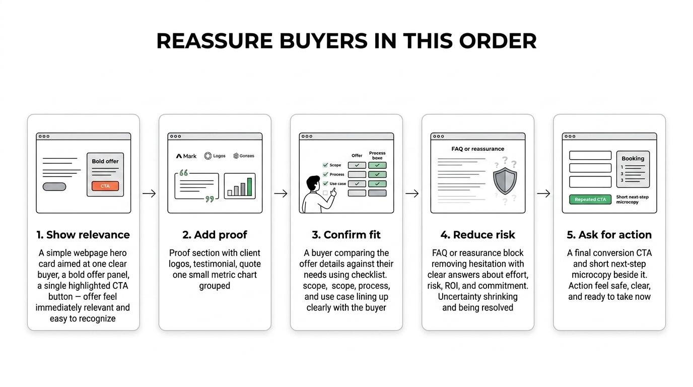
Next BOFU page build: a practical blueprint
If you are building or rebuilding a BOFU page, do not start with design comps. Start with buyer intent.
Write the page in the order a serious buyer needs to say yes: relevance, proof, fit, risk reduction, action. That sequence works across service pages, demo pages, pricing pages, and comparison pages because it mirrors how decisions are made.
A simple working blueprint is often enough:
First screen with a sharp offer and CTA.
Immediate proof beneath it.
Benefits framed as business outcomes.
Specific details on what is included.
Case studies and testimonials near key decision points.
FAQ that removes the last objections.
A repeated CTA with clear next-step microcopy.
That foundation is strong because it respects the buyer’s time and gives high-intent traffic a page worthy of their intent.
When BOFU pages are built this way, they do more than convert visits. They shorten evaluation cycles, improve lead quality, and make the sales conversation easier before it even starts.


